It's a big week for birthdays in my family this week with my husbands 40th today, and my niece's 6th tomorrow, so it works out well the theme for this CAS-ual Fridays challenge is Birthday Bash. Obviously this card is for my niece, not my husband!
The weather has taken a turn for the ugly, but I'm trying to keep it positive with a summery pinwheel spinner. Question is, can a spinner be CAS? My friend Sue says yes, as long as it's not "frou-frou". I'd say it's more clean than frou-frou. I don't really do frou-frou!
I thought this DSP was really cute and just the right scale for this pinwheel. I hope my niece likes it even though it's not pink. Pretty much everything she owns is pink and purple, but I suspect that's because my sister is the one picking it out, and I think, at 6, she should be expanding her horizons! Besides, I don't have any pink DSP. I used a 2 inch square for the pinwheel, and several layers of white and one DSP die cut to simulate a chipboard number.
Does this pinwheel remind anyone else of being 6?
Thanks for stopping by,
T
Supplies
SU: pawsitively prints II DSP, word window punch, tempting turquoise ink
PTI: stampers select white cardstock
Cuttlebug: number die
CTMH: tiny typewriter alphabet
other: flower brad, pop dot, scotch foam tape, pennies
Tuesday, 30 April 2013
Sunday, 28 April 2013
Make it Monday #113
Now that my husband's 40th is over, I can spend some time playing in the craft room. I wanted to participate with Make it Monday this week because I love Perfect Pearls and haven't used them for a long time. So long, that I discovered today that both my cubes of Perfect Medium are disintegrating! Little bits if goopy foam everywhere. I also learned today that Perfect Pearls are far more impressive in person than in a photograph, though I suspect this may photograph better in daylight. Too late for that tonight, but these butterflies are actually quite pretty. I may try this again with the Aged Patina set once I get some new Perfect Medium.
Thanks for stopping by,
T
Supplies
PTI: stampers select white and basic black card stock, beautiful butterflies
SU: lovely lilac card stock, scallop trim border punch
Ranger: perfect pearls - interference
Crop-a-dile: deco corner chomper
Friday, 26 April 2013
Muse #14
Must get back to cleaning now. We are having over 50 people here tomorrow night for my husband's 40th birthday. Guess I should have followed that tried and true rule people do with their kids and only allowed him to invite the same number of people as his age!
Here's the sunny card by Virginia Lu that was the inspiration for my project.
Thanks for stopping by,
T
Supplies
SU: daffodil delight cs, daffodil, melon and ballet blue inks, melon mambo polka dot grosgrain, teeny tiny wishes, seeing spots, word window punch, scallop trim border punch
PTI: stampers select white cs, heart-2-heart 7 stamps and die
other: pop dot
LIM 116/ 10 min. Craft Dash 16
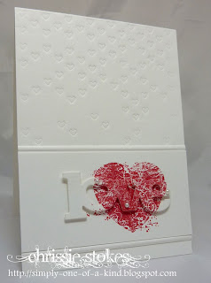
Wow! I saw an idea on Less is More today that really inspired me. It was one of those "Why didn't I think of that?" moments. I'm more than a little pressed for time this week, but was compelled to join in on the fun, so I thought why not try to do this technique in a 10 minute format?
Here is the card Chrissie posted that has me gobsmacked:
See how the same image is stamped on the card base, and again on the popped up die cut sentiment? It's a cool effect. Simple, yet striking. My favourite combination!
I thought I would try it using the color combo for the latest 10 Minute Craft Dash Challenge seen here:
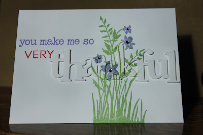
Here is my take on this technique:
I used my Stamp-a-ma-jig to get the placement just right. In the interest of speed, I stamped the entire image with a green ink pad, then "erased" the green from the flowers with a blender pen, and colored them with a purple marker before stamping. The rhinestones are colored with a melon marker.
This picture from last night is a tad dark, but in this lighting, without the flash, you can really see the shadows which highlight the popped up sentiment.
I'm not entirely sure this card is really "done", but that's all I had time for in 10 minutes. Well, 9 and a half, but I couldn't think of what I could add to it in half a minute that would be an improvement, so I left well enough alone. I could have rounded a corner or two, but don't think that's the answer. I also considered adding some embossed lines, or embossing a texture on the bottom third, but wasn't totally sold on either idea. Sometimes simpler is better, so I'll just leave it for now.
I really did enjoy this technique, and I think I will be using it again soon.
Thanks for stopping by,
T
Supplies
SU: just believe, wild wasabi/lovely lilac/melon mambo inks
PTI: white stampers select cs, wonderful words die and stamps
other: Recollections rhinestones, Scotch foam tape
Tuesday, 23 April 2013
Fire
This is a good news, bad news story. The bad news is, I didn't have time to do One Layer Wednesday this week, or anything else, so far. The good news is, the derelict house across the road is finally gone. The fire department came a burned it down last night. Who knew it would turn into a driveway party? It was a bit of a spectacle, and a few neighbours showed up for a piece of the action. Luckily it was a lovely evening with no wind, so we pulled out some lawn chairs and passed out some drinks.
Here's a "before" shot, when they were getting organized and hosing down the trees:
Apparently they put flax bales in the house to get things going. You can see the flames in the empty living room window on the left, and the garage on the right, which went up really quickly:
Here is where it finally got going. It took a lot longer than I thought it would, but apparently the house was pretty wet. The garage must have been fairly dry, because it was already gone:
A couple of hours in, the roof was gone and all that was left was a shell:
I thought that was pretty much the end of it, but I was mistaken. I think they must have added some fuel to speed things up at the end:
It never did quit. Once the walls fell into the basement, the fire department packed up and left, around 10:30, but there were still flames at midnight when I went to bed. Had to wait 'til morning to get an after shot before I left for work, and even then, there was still a bit of smoke rising:
Well, that looks better, and the trees are looking good. The ones that were right in front of the house may have some damage, but the rest should be in good shape.
I didn't get home 'til 9:30 tonight, so no time for stamping. :( Just enough time to make Thai coconut curry soup for stamp club tomorrow night, and write a quick post, but hopefully I'll have time to do at least one challenge before my husbands big 4-0 birthday party this weekend!
Thanks for stopping by,
T
Saturday, 20 April 2013
Make it Monday #112
For this Make it Monday, Ashley demonstrated embossing on alphabet die cuts. Sounds like fun, and my shoe box is a little light on baby cards, so this is what happened: some color blocking with white embossed baby themed images, and white die cut letters embossed with blue stripes. Quick and fun!
Thanks for stopping by,
T
Supplies
PTI: stampers select white and lemon tart cs, modern alphabet dies, background basics: super stripes
SU: pool party, pear pizazz, and almost amethyst cs, little additions, a slice of life, pool party button
CTMH: tiny typewriter alphabet
other: Stampcraft baby feet, Versamark ink, detail white embossing powder, green bakers' twine, Copic marker
Muse #13
Happy Muse day! I'm so happy that I finally had a chance to try out this new window die that I bought a few weeks ago. Love it. I have a few ideas for this one, today using the window box to hold my flowers.
Here is the beautiful card by Marion Vagg posted on Muse for inspiration:
As you can see, her richly colored flowers were the inspiration. I used basically the same color scheme except that I flipped it, using mostly green, with white as the accent color.
A small piece of clear cardstock is inserted under the window to make it look glassy.I'm off to make a cappuccino and vote on my favorite Muse cards. I'm sure it will be a hard choice, as usual, but I can't think of a better way to spend a Saturday morning!
Update on the home front: Bad news - still surrounded by piles of snow, and the possibility of a bit more tomorrow. Good news - the abandoned house across the road is scheduled to be burned down on Monday.
Thanks for stopping by,
T
Supplies
card stock: white/limeade ice/clear (PTI), eggplant (SU), scrap of shiny white for the window frame
inks: berry sorbet/chartreuse (PTI), eggplant (SU), Versamark
dies: small Madison window and flower box (Memory Box), heart 2 heart #7/woodgrain impression plate (PTI)
stamps: heart 2 heart #7 (PTI), happy birthday (Stampendous), plaid background (Martha Stewart)
other: detail white embossing powder (Stampendous), iridescent rhinestones (Recollections)
Wednesday, 17 April 2013
Less is More 115
The challenge this week on Less is More is to create a one layer card based on a movie. Can you guess what movie this is? Shawshank Redemption was too hard, so I decided to do On Golden Pond instead!
I masked off a square area and stamped some grass for reeds, then masked off the bottom section as water. I punched out a circle to mask off the sun, and sponged some sunset sky colors, then put the piece of paper I cut the sun mask from over the sky to sponge the sun. Then I moved the water mask up to protect the sky/sun and sponged the water adding some orange wave crests as a reflection of the sun. All that was left to do was to punch out some slots in brown to glue on for bulrushes and added a greeting.
Thanks for stopping by,
T
FFC06 - Retro
The theme for the latest Festive Friday challenge is "retro":
My husband is the king of retro, so I was surprised when I sifted through my Christmas sets and found that didn't have much stuff with a retro look, but this ornament from an SU set reminds me of some ornaments my Grandma used to have on her tree. When I hear retro, I usually think of mod 60's style, this seems more like vintage. Maybe I can sell this as uber retro?!
I embossed the greeting and string in gold before embossing the panel with a texture. The gold embossed ornament was die cut and popped up to emphasize the focal point.
Thanks for stopping by,
T
Supplies
SU: very vanilla cs, keepsake ornaments stamp & die, hung up on the holidays, damask texture plate
Other: Versamark ink, Stampendous detail gold embossing powder, Stampabilities sentiment, corner chomper, Scotch foam tape
Monday, 15 April 2013
Fusion #2
It's Fusion time! If you're not familiar with this new challenge, it's a great concept. First of all, everyone can vote on their three favorite projects, and secondly, you have a choice to use the sketch for inspiration, or the photo, or combine the two. I opted to do the "fusion" this time around. Here's a look at the inspiration behind this project:
I embossed some smoky shadow strips with lime embossing powder using some geometric background stamps. I thought the patterns and color scheme were great for a "man card", and my hubby's big 4-0 happens to be this month, so I threw in a soccer ball and some die cut numbers to personalize it for him. It's hard to see in the pic, but the ball and numbers are popped up to help them stand out amid the strong patterns and colors.
I'm pretty stoked about this card. I tend to struggle with ideas for guy friendly cards, but this one came together pretty easily, and I think my husband will love it. (He didn't appreciate the card I posted for Fusion last week. Apparently, "Black and flowers don't go together, unless it's for a funeral or something." I guess he's some kind of design expert now?! Too funny).
Backyard update: not good! The snowbank grew again today. I think it's back to 10 ft. deep again. Mother Nature is officially in my bad books.
Thanks for stopping by,
T
Supplies
PTI: white, smoky shadow and chartreuse cs, happy harlequins, think big favorites, smoky shadow ink
Other: Martha Stewart background set, Cuttlebug number dies, Versamark ink, leaf Zing embossing powder, Michael's dollar bin soccer ball stamp, SU 1 3/8" circle punch, Scotch foam tape
OLW 135 - CFC 98
I wish I had downloaded these pics before giving this card away. I thought it looked fine on the camera screen, but now I'm thinking I should have used the flash. Oh, well. I'm sure you'll get the idea. You just have to imagine that this is white embossing and glitter on blue, not blue and blue on blue! This will make a terrible thumbnail.
I was in the middle of designing something tall and thin for One Layer Wednesday when a friend called and said she needed a card for a wedding shower, preferably something in blue. I told her I was sure I had something that would work. When I looked in my shoe box, I was surprised to find I only had 3 shower cards, and nothing remotely close to blue. So I quickly embossed "for your shower" at the top of this card, and a couple of strips of scor tape and some dazzling diamonds glitter for pizzazz. If only I had thought to work in some pink and darker blue, this could have linked this to the 10 minute Craft Dash! (I'm just kidding. I would not try to add pink and dark blue on this particular card, but it did have to come together quickly). The glitter is the "icing" on this "cake", which ties in nicely with the CAS-ual Fridays Challenge, all that glitters.
This is the first time I've tried this new looped flower background from Hero Arts, and I'm quite thrilled with it. I think it will be a long time favorite!
Thanks for stopping by,
T
Sunday, 14 April 2013
Make it Monday #111
This week's challenge at Papertrey Ink is water coloring embossed images. I love water coloring, and these butterflies from Martha Stewart are perfect for this technique. I embossed them with SU espresso emboss powder on pool party cs, and water colored them with a variety of reinkers. I stamped the greeting from PTI's beautiful butterflies set in SU inland indigo, and embellished the panel by stamping espresso stitching with PTI's sew simple borders and adding a scalloped border with an SU punch. The finishing touch was adding a PTI simply chartreuse button with espresso twine, before matting the panel with early espresso cs and attaching to a white PTI card base.
Thanks for stopping by,
T
Thanks for stopping by,
T
Saturday, 13 April 2013
Muse #12
I am in love. I can't believe this set hasn't seen the light of day in about 5 years! Why haven't I been using it? I love delphiniums. Well, I'm definitely going to get my money's worth out of it now. (Actually, it was a free hostess or Sale-a-bration set, so that has already been accomplished). I have to say, this blog is really working out well. Doing challenges is a fantastic way to get out of your rut and use some long neglected supplies.
Speaking of challenges, I created this card for the Muse Challenge. Here is the gorgeous Muse posted by Therese Calvird:
Aren't the colors just gorgeous? Therese has me wishing I had some Prismacolor pencils. I had to make do with a blender pen and ink pads.
My goal was to capture the simple and natural feel of this card.
I stamped all of the elements on PTI rustic cream cardstock with sepia Versafine ink, then added color with a blender pen, and dazzling diamonds glitter with a 2-way glue pen, and voila! (The ink colors are SU's razzleberry, ballet blue, and lilac).
I really loved this card as a one layer, but I had started on the other side and smudged the stamping, so I flipped the card over and did this version on the back as a tester to see how I wanted the placement, and what ink colors I should use. It was a "keeper", so I had to cut it in half. I trimmed it down a smidge and adhered it to a kraft base. I think I preferred the one layer. What do you think?
Time to go and check out the rest of the challenge participants and pick out my 3 favourites.
Thanks for stopping by,
T
Stamp sets used: echoes of kindness (SU, retired), infinite goodness (SU, retired), signature greetings II (PTI, never retiring!)
Thursday, 11 April 2013
Less is More - week 114
I happened upon a challenge blog today called Less is More, and the current challenge was lime and black. I'm all about lime, so how could I pass that up?! I made time for a quick card, just some lime embossing on black with a few finishing touches. Keeping it really simple today.
Thanks for stopping by,
T
Supplies
true black cs, happy hexagons (Papertrey Ink), lucky limade cs and ribbon, pleasant poppies (Stampin' Up), Versamark ink, Zing leaf embossing powder, corner rounder punch
Thanks for stopping by,
T
Supplies
true black cs, happy hexagons (Papertrey Ink), lucky limade cs and ribbon, pleasant poppies (Stampin' Up), Versamark ink, Zing leaf embossing powder, corner rounder punch
RIC#33
So happy I had time to play along with the Runway Inspired Challenge this week. I love yellow, especially for spring, so this picture really caught my attention. I'm even wearing a sunny yellow shirt right now. ;)
The first thing I noticed was that the sweater reminded me of side 1 of the diamonds impression plate from Papertrey Ink, so I impressed some lemon tart card stock as a background. The skirt reminded me of a ruffled flower, so I set to creating one, using the second smallest size of the floral Framelits dies from Stampin' Up. I die cut 2 flower shapes from daffodil delight card stock, using one as a base, and cutting slits in the second and rounding the petals to make it 3 dimensional. I punched a smaller flower shape for the center with a retired 3 flower punch from SU, and colored the center darker with a Copic marker. I also sponged the inside of the cup and the base petals with a bit of daffodil ink to give them more depth. To "ground it", I added a strip of 1/8" black satin ribbon with a bow to mimic the photo.
That left a lot of empty real estate, so I needed a larger greeting for balance. It was the perfect opportunity to try out my new wonderful words: hello set from PTI. I stamped "hello" in daffodil on daffodil and die cut it, then cut another from true black as a shadow to help the greeting stand out, and matted it all with a touch of true black.
Unfortunately, no matter what settings I try, I can't get the colors on this one to read accurately. The background is really more lemony than this pic.
Here's another that's a bit better.
Thanks for stopping by,
T
Tuesday, 9 April 2013
Fusion #1
It's an exciting day! I'm finally posting a card for the very first Fusion Challenge. Like the Muse challenge, participants and readers can vote for their favourite 3 cards, so make sure to check out the web site. There are already a ton of great projects posted there, and lots of inspiration to be found. I really don't know how I'm going to vote on this! It will be so hard to narrow it down to just 3.
Here's a look at the Fusion concept:
I opted to do Lesley's challenge because I loved the vibrant colors of the spray of flowers and the graphic quality of the black and white striped table cloth. I used some white scraps to make the stripes, and embossed the flowers in white on white before sponging them with ink and fussy cutting them. I cut the sprays with a leaf die, and cut some more in white and sponged them the same color as the flowers to create flower buds. It's a fairly bold look, so a simple white sentiment was all it needed to finish it off.
Thanks for stopping by,
T
Supplies
SU: daffodil, melon, and pumpkin pie and pear inks, pear cs, reason to smile, little leaves
PTI: white and black cs, beautiful butterflies sentiment
Other: Versamark ink, detail white embossing powder
Monday, 8 April 2013
OLW 134 - Threesome!
The card I'm posting today on Ardyth's blog for One Layer Wednesday has 3 sets of 3. I used 3 stamps (the script background, the leaf, and the sentiment), I stamped the leaf 3 times, and I highlighted the leaves with 3 ink colors.
That's all for today. Sort and sweet! Time to tune in to The Voice and do a little stamping.
For anyone who is curious about the falling down house across the road that was supposed to be burned down on the weekend, we are still waiting. They had planned to try again this evening, but it's too windy. Better luck next time?
Thanks for stopping by,
T
Supplies
SU: naturals ivory cs, french foliage, just believe, pear, daffodil and peach parfait ink
Other: PTI fine linen ink, Stampabilities faded text background, Versmark ink, Stampendous copper embossing powder, painter's tape
Sunday, 7 April 2013
Make it Monday #110
Collage elements is the focus of this Make it Monday Challenge. It sounded a little daunting, but Dawn inspired me to give it a try. My husband is still curling (they made it to the final game and I am waiting to see if they won the bonspiel) so luckily I had some free time for stamping today. I figured I could just toss it if it didn't turn out, but I have to say, I'm actually pretty happy with the results! Although using this technique felt a little foreign to me, somehow this project ended up looking very "me". I think I've been converted, and I may actually be inspired to try this again another day.
Update: I kept looking at this card and thinking the bottom corner looked a bit empty, so I added an xo with a dollar bin stamp. I think it's done now. : )
That's all for today.
Thanks for stopping by,
T
Supplies
PTI: rustic cream and simply chartreuse cs, chartreuse and fine linen ink, turning a new leaf stamp, wonderful words die and stamp, rhinestone
SU: pool party cs, pool party, kraft and espresso ink, fabulous florets and summer silhouettes stamps
Stampabilities: woodgrain and faded text background stamps
Saturday, 6 April 2013
Muse Challenge #11
Saturday! My favorite day of the week. I stayed up very late last night to work on this card because we had a terrible volleyball game, and I was determined to finish off the day on a positive note. Also, the fire department is supposedly burning down the condemned house across the road this morning, so I figured I would be distracted by that, but there's been no action yet. I hope it's still on. We have been waiting for this day since fall. I'm anxious to see how they control it. I wouldn't want to see any of the trees get damaged. It's a beautiful lot, minus the house (the living room window just fell right out of it last winter!).
I'm not sure what happened with this card. I started out intending to use the layout from the inspiration card on Muse, but I had some new toys I was dying to play with, so I went off on a bit of a tangent! I just couldn't bear to cover up the die cut strip, so I changed up the layout. I'm loving this new Memory Box die called Piestra Tile. Piestra? I've never heard of that before, despite the fact I have this exact same pattern as my background on this blog, and some throw pillows on my couch (and an embossing folder, and a new background stamp I haven't taken for a test drive yet. You get the idea. I'm a tiny bit obsessed with it). Do you like how I worked a matching throw pillow into this shot? ; )
The birthday greeting is new, too. I hope you can see better in this photo that it has a chevron pattern which gives it a fun texture.
Well, I did use the color scheme, some polka dots, and a bit of bakers' twine, so I guess I'm not completely off track. Here is the lovely Muse card provided by Laurie Willison:
Thanks for stopping by,
T
Supplies
SU: early espresso and pool party cs, pool party ink, beautiful butterflies bigz die, beautiful wings embosslit, espresso bakers' twine.
PTI: white and limeade ice cs, limeade ice ink, wonderful words: birthday
Memory Box dies: piestra tile
Subscribe to:
Posts (Atom)