Thursday, 9 May 2013

PPA158


I wasn't sure I was going to participate in this Pals Paper Arts challenge. Much as I love all these colors, I was having trouble envisioning all 3 together in one project.
PoolStarfruitLimeade
After playing with them a bit, this combo has grown on me. I don't love, love, love this card, but the more I look at it, the more I like it.
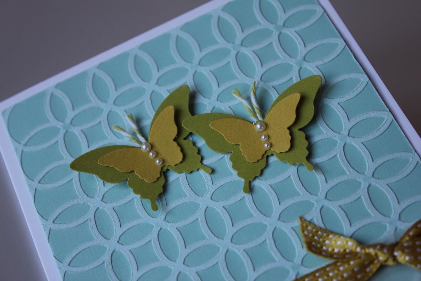
I've been in love with these butterfly punches since the first time I saw them, but this is the first time I've put them into action. They are so pretty, but I debated whether they would look better stamped. I opted to leave them plain because I didn't want them to compete with the pretty, sanded background texture. Sometimes simpler is better.

I most often lean towards odd numbers, but decided to add 2 butterflies and make this a wedding card. I have a special bride and groom in mind that I think will love these colors.

Thanks for stopping by,
T

Supplies
SU: summer starfruit and lucky limeade cardstock, pool party core'dinations, lucky limeade ink, summer starfruit stitched satin ribbon, elegant and bitty butterfly punches
PTI: stamper's select white cardstock, beautiful butterflies sentiment
other: Reflections vellum and pearls, lime baker's twine, sandpaper

Wednesday, 8 May 2013

FFC07 - bird


I guess I'm not much of a bird lover. I scoured my stash for a dove or something suitable for Festive Friday's challenge to make a holiday project using a bird, but couldn't find what I was looking for. I was so thrilled when I remembered I had this penguin, a flightless bird, but a bird nonetheless. I bought this before Christmas, but hadn't used it yet. Can you believe that!? He's too cute to be left collecting dust. I'm so happy he's finally getting some love. That's probably why he's bursting with joy.

Here is the inspiration for this project:


Thanks for stopping by,
T

Supplies
SU: whisper white and pool party cardstock, basic black/poppy parade/daffodil delight inks, merry & bright snowflakes, dazzling details, blender pen
PTI: winter penguin set and die, holiday lights sentiment, in the meadow dies
Other: Versamark ink, Stampendous winter wonderland embossing powder

Tuesday, 7 May 2013

OLW 138

I love doing one layer cards once in a while. I think it's good exercise for your designing brain to plan everything out before you begin. Most of the time, it works out pretty well, and when it doesn't, it just becomes a non-one-layer card! A die cut butterfly or flower can hide almost any screw up.

The theme for this One Layer Wednesday challenge is anything spring, so I went with some field flowers and spring moss and baja breeze sponging in a favourite one layer layout.

I normally think of yellow when I think of spring flowers, as in tulips and daffodils, but I'm not seeing any flowers around here yet. Just grass that's greening, and blue sky, along with some snow. I may need to buy some pots full of flowers this weekend to speed things up a bit and jazz up the deck for Mothers' Day since I am hosting. At least I'm being sung to sleep these days by a symphony of frogs. Flowers must be soon to follow, right?

Thanks for stopping by,
T

Supplies
PTI: spring moss ink, stampers select white cardstock, signature greetings II
SU: field flowers, kraft and baja breeze ink
Other: script background, Versamark ink, clear embossing powder, painter's tape

Monday, 6 May 2013

RIC: baby shower

I'm squeaking in under the wire for the Runway Inspired Challenge. This time around, the inspiration comes from Little Marc Jacobs in celebration of DT member Aga's new bundle of joy, Helena. I was so thrilled to see these neutral colors instead of the usual, pink ruffles, so had to join in and play along.

Thanks for stopping by,
T

Supplies
PTI: rustic white, kraft and true black cardstock, script sentiments, kraft swiss dot satin ribbon
SU: swiss dots embossing folder, basic black ink
Other: Stampcraft baby feet stamp, Versamark ink, Stampendous detail white embossing powder, Nestabilities oval dies

Fusion #5


I am in need of some more Mothers' Day cards, so decided to make one using the layout from the Fusion challenge. I love the simplicity of this design, and it was really quick to whip something up some leftover strips of cardstock in bright, "springy" colors.

Here's a look at the inspiration behind this project:


I was so impressed with this layout that I used it to whip up a couple more cards in different color schemes. I may even make a few more this evening!
Thanks for stopping by,
T

Saturday, 4 May 2013

Muse #15


Happy Saturday! I'm settling in with a coffee to spend some time looking at some eye candy on Muse and narrowing down my 3 faves.

Here is this weeks Muse, created by Jen Mitchell.

As you can see, I basically followed the layout, as well as the color scheme, and certain elements such as a butterfly, embossing and and button.

I stamped my butterfly on vellum, and colored it with Copics, then cut it out the hard way. I made a blue and yellow plaid panel for a bit of pizzazz with some sponging, stamping, and a dash of black Sharpie, then die cut the word "you" out of the center to reveal the black mat underneath. I think you'll be seeing some more vellum butterflies and more plaid from me in a variety of colors in the near future! It's so much fun watching them come to life.

Making plaid is right up my alley. I even have a plaid dining room wall.

This room is on the east side of the house, and in the morning light, this green seemed a little loud when I first painted it, though it doesn't look as green in this picture as in real life. I was concerned that my husband would hate it because it was too bright, so I decided to tone it down by throwing in the rest of our colors to break it up a bit. It really did make a huge difference, and I was surprised at how 3 dimensional it looks because the colors don't blend like a true plaid. People are always surprised to find out it's painted on. I'm happy to say, after 7 years, I'm not the least bit tired of it and am not planning to change it anytime soon. It still makes me happy every time I walk in the door.

Thanks for stopping by,
T

Supplies
PTI: stampers select white and true black cardstock, background basics: super stripes, diamond impression plate, wonderful words die, white button
SU: basic black, pool party and daffodil delight inks, just believe
Martha Stewart: butterfly
other: black Sharpie, white embroidery floss, yellow Copics, corner rounder, painter's tape

Wall: 5 shades of paint, 3 rolls of painter's tape, laser level, 3 evenings, and some patience!

Wednesday, 1 May 2013

Fusion #4


A quick card and a quick post for the Fusion challenge this week. I love this DSP, which I used yesterday for my niece's birthday card, and could see it working with Jackie's sketch, so I pulled it out again. 'Tis the season to stock up on mothers' day cards. It didn't really turn out the way I pictured it in my head on a white card base. It was really bland and unfinished looking, but changing the card base to yellow and giving it some texture adds something to it.

Here's a look at the theory behind the Fusion challenge, and the sketch I used as my starting point:

Thanks for stopping by,
T

Supplies
SU: barely banana and tempting turquoise cs, pawsitively prints dsp, word window punch, swiss dots embossing folder, beautiful wings embosslit, teeny tiny wishes, tempting turquoise ink
other: corner rounder, green baker's twine, PTI white button