Wednesday, 29 May 2013

Fusion #8

A quick card and post for this week's Fusion challenge - I was inspired by the photo to do a water colored background in a rainbow of colors to highlight he flower silhouette embossed in espresso. Speaking of espresso, I could really use a cappuccino right now to get me kickstarted!

Looking forward to checking out some eye candy on Fusion later today.
Thanks for stopping by,
T

Supplies
SU: daffodil and espresso cardstock, espresso emboss powder, pool party/pear/daffodil/pumpkin pie/poppy/melon reinkers, teeny tiny wishes, word window punch
other: Hero Arts wildflower garden, Versamark ink, Michael's satin ribbon

Tuesday, 28 May 2013

CSC142


The Case Study challenge blog has been featuring one of my most favourite designers this month, the awe inspiring Maile Belles. I'm disappointed I didn't have time to join in on casing her fantastic cards the last few weeks, but happy I could play along this week.

I'm not even trying to be original on this one. Her card is beautiful, and I was fascinated with her technique of painting with glimmer mist, and wanted to try it, so this is pretty much a straight up CASE. Here is the inspiration:

I'm not sure how well you can see the shimmer on my daisy. I made my own "glimmer mist" with several drops of water, a drop of coral reinker, and a drop of frost white shimmer paint. I overlapped 2 daisies and added a punched out center for more dimension.

Thanks for stopping by,
T

Supplies
PTI: stampers' select white cardstock, turning a new leaf stamp, think big favorites #13 setiment, spring moss ink
SU: mixed bunch daisy stamp, summer silhouettes leaf stamp, pear pizzazz ink, cameo coral reinker, frost white shimmer paint
other: Versafine sepia ink, Recollections pink adhesive pearls

Saturday, 25 May 2013

PTI May 2013 Blog Hop

I'm at it again, making plaid! I'm totally addicted ever since I got the super stripes set. This time it's for the Papertrey Ink May Blog Hop. I been wanting to join in on one of these forever. I'm finally diving in, though I've waited 'til the last minute to work on this so am now madly typing a post just before I run out the door to a potluck at the gliding club, so I won't go into a lot of detail. I decided to do a bouquet of hydrangea-like flowers inspired by this palette:

4-Shades-of-Yellow-Bouquet
I don't have a ton of floral sets from PTI, I guess because I had a lot of florals before I discovered PTI so I've prioritized other sets, and none of the flower sets I have seemed to work well with the picture in my head. I was really stuck on this layout and the idea of a bouquet, and I wanted to use this vase to put them in. I guess I could have used something non-PTI, but ended up punching flowers rather than using flower stamps, just because these were the right scale for the vase, and seemed the right style to work with the plaid background. So, although I probably use florals most frequently, I ended up not stamping any flowers on a challenge to stamp flowers! Sometimes you have to go where inspiration takes you!

Thanks for stopping by,
T

Supplies
PTI: white/limeade ice/lemon tart/harvest gold cardstocks, spring moss/limeade ice/lemon tart inks, mega gracious vases die, turning a new leaf, super stripes, script sentiments
other: SU flower punch, Versamark ink, white embossing powder, Copic marker, dollar bin satin ribbon, pop dots.

Friday, 24 May 2013

Muse #18

 
This week's Muse challenge inspired me to create a flower garden in some bold, primary colors, and contain it with this adorable little woodgrain fence that's been crying to be used. Once I squeezed all of that on, along with a butterfly and pierced flight path, there was no room left for a greeting. I didn't want to repeat last week's sky banner, so I hung a sign on the fence instead. Problem solved. I just love it when a "fix" ends up like like it was planned all along! Serendipity.


Here is the vibrant Muse created by Marion Vagg. Check out her gorgeous coloring!


Thanks for stopping by,
T

Supplies
PTI: white, limeade ice and kraft cardstock, limeade ice ink, flower fusion and heart-2-heart #7, beautiful butterflies
SU: daffodil delight, poppy parade and ballet blue inks
other: Martha Stewart grass punch, Hero Arts everyday sayings, Die-Namics woodgrain fence die, green baker's twine, white gel pen

Wednesday, 22 May 2013

FFC08


I didn't have a lot in my stash that would work as something "sweet" for this Festive Friday challenge. Just a tiny little gingerbread man, so I also used my super stripes set to create a candy cane background for the little guys. They look pretty happy, so "very merry" seemed to be an appropriate greeting. I created a negative die cut of the word "merry", and popped up the panel. I cut it down a bit first, which conveniently provided me with some trim for the gingerbread man chain. I added some dazzling diamonds to them as sugar to make them a little sweeter!


Thanks for stopping by,
T

Supplies
SU: soft suede cardstock and ink, pure poppy ink, hung up on the holidays, riding hood red baker's twine, dazzling diamonds
PTI: white cardstock, background basics: super stripes, wonderful words: holiday stamp and die
other: button, 2 way glue, pop dots

Tuesday, 21 May 2013

Fusion #7

Time for another Fusion challenge. Again, I chose to fuse the two elements, using both the layout and the neutral color scheme, twine and polka dots from the photo.
That's it for this post. Just a quick one.
Thanks for stopping by,
T

Supplies
PTI: kraft cardstock, fine linen patterned paper & ink, think big favorites, wonderful words die
SU: naturals white cardstock, vintage vogue, linen thread
Other: Versamark ink, white detail embossing powder, white gel pen

10 Min. Craft Dash #18


Time for another 10 Min. Craft Dash, and I do mean 10 minutes. I've done a few of these, and I don't think I've ever finished in less than 9:30. I don't know how anyone is able to finish in 7 or 8 minutes? I just squeaked in under the wire with a few seconds to spare, and only because I used a lot less adhesive than I normally would! Maybe I should skip the embossing, but apparently I'm an embossing addict.

I thought this color combo would be lovely on a baby card, so I embossed an itsy bitsy baby on each of the 3 sample colors (lavender moon, lemon tart, and spring moss from PTI) and punched them out. The ribbon is from Michael's, but is a pretty good match for lavender moon. Better than it would appear in this photo which makes the lavender card stock look a bit pinkish.  I embossed the lemon tart background with stars and adhered everything to a packaged white cardbase from Michael's. It's probably hard to tell in this picture, but the banner says welcome baby.

Here is the inspiration behing this challenge:
CD_18
Thanks for stopping by,
T

Monday, 20 May 2013

OLW140 - Borders

This has to be the worst weather I've ever seen on May Long weekend. It is typically a little dicey, but 3 days of rain is a pretty sad kick off to summer! At least it's not snowing. 60 centimeters in Newfoundland this weekend! Yikes!
 
I'm not able to do any of the house painting or gardening I had planned to tackle this weekend, so am turning my attention to cooking and stamping instead. Heather issued a challenge for One Layer Wednesday to create a card with nothing more than a border and a sentiment. I masked off a fat border, and embossed it with Dot Spot from PTI, then sponged over it with Limeade Ice and SU Cool Caribbean inks. A sentiment from PTI's Think Big favorites and some rounded corners finish it off.
 
This was actually my second attempt. On the first, I stamped the sentiment with Midnight Muse, which seemed a little too dark, and I thought maybe I had stamped it a tad too high. Then I noticed I had smudged blue ink on the white background!
No problem. Almost any smudge is salvageable by employing my go to trick of gluing a butterfly over it!

Thanks for stopping by,
T

Saturday, 18 May 2013

Muse #17

Happy Saturday! For me, that means time to participate in another Muse challenge. When I looked at the challenge, I saw a baby themed card with a lot of pattern.
 
Here is the inspiration provided by the talented Therese Calvird:
I used the colors of her striped background to make a plaid sky. Why not? I loved the little banner held by the pink elephant, but since my baby hedgehog is holding onto a bottle,  I turned it into a sky banner pulled by a polka dot butterfly.
 
I finished it off by adding a hill to "ground" the hedgehog, and some liquid applique to  to make the clouds puffy, then adhered it all to a lemon tart base.

Question for you Blogger experts: Why can't I make this last picture larger? Occasionally, when I click on a picture to highlight it, the box that allows you select a size, remove the picture, etc. fails to appear.

Thanks for stopping by,
T

Supplies
PTI: lemon tart and limeade ice cardstock, beautiful butterflies stamp and die, cloud dies, in the meadow die
SU: cool Caribbean/daffodil delight/pretty in pink/pear pizzazz inks for sponging, Bermuda bay and melon mambo markers, itty bitty banner die, little additions greeting, linen thread
Other: Penny Black hedgehog, Marvy liquid applique, Scotch foam tape, unknown punch for polka dots

Thursday, 16 May 2013

LIM119


I could not decide whether to emboss this stamp in white or espresso. So, I did both to see which I liked better. I still can't decide, so I'm posting both. What do you think?

This all started because of the Less is More challenge to do a one layer card with coloured cardstock rather than a neutral shade. Sounds like a fantastic idea to me, I'm all about colour, but it's so hard to pick just one. Apparently I was in an indecisive mood and that hasn't changed. I'm still undecided over whether the green card needs some ribbon added, or maybe some corner rounding? Which corner(s)? I just left it alone since I wasn't sure either of those ideas would really be an improvement. I can always change it later, whereas, if I tried changing it and didn't like the results, there would be no fixing it unless I started all over again. One layer cards are less forgiving that way.

Hmmmm, now I'm thinking about giving the green card some sort of trimmed edge next to the "Thinking of You", as though I'm underlining it. Maybe I'll become more decisive after dinner and try that? For now, I'm posting it in it's pristine state.

Thanks for stopping by,
T

Wednesday, 15 May 2013

Fusion #6


This is the perfect card to suit my mood this morning. I have a caramel macchiato on the brain! There is a new Starbucks at the hospital across the street from where I work, and it is a beautiful morning, so I think a walk at coffee break is in order.

The inspiration for this project was the Fusion challenge. As you can see, I followed the layout from Jackie's sketch, but also borrowed a coffee cup from Lesley's photo. I stamped it on a fine linen tag because it reminds me of a latte. I stamped the mug again on limeade ice and cut it out so it would be the same vibrant green as the stripes that anchor it. Putting it all on an espresso colored base only seemed logical, and the white card base frames it.


I tried putting the middle strip on top of the tag, but it just didn't look right. Maybe I could add stitching to it, and just have the stitches running over top of the tag?

Update with stitching added:
I think maybe I liked it better without the stitching? Oh, well. It does look better in person.

Thanks for stopping by,
T
Supplies
PTI: fine linen/limeade ice/white cardstock, tag sale 5 die
SU: espresso ink and cardstock, cocoa marker

other: TPC Studio café mocha, green baker's twine, white pencil, scrap of pink

Monday, 13 May 2013

OLW139/cQc188

This is a quick little post for a quick little note-sized card. I made it for the One Layer Wednesday challenge issued by Cheryl to make a 3 inch square card. The color scheme was inspired by this colorQ challenge:

I did a floral background inspired by this skirt, with a little bling for some sparkle.

Thanks for stopping by,
T

Supplies
SU: sage shadow, cameo coral and so saffron inks, botanical blooms, scallop trim border punch
PTI: white cardstock, script sentiments, smoky shadow ink
other: Reflections iridescent rhinestones

Sunday, 12 May 2013

MIM #115

Man cards are always a struggle for me. I have a number of supplies specifically for this purpose, like this diamond plate impression folder, but it's so much more fun to play with my millions of flowers and butterflies! When I saw Heather's Make it Monday video, embossing on items other than paper, I thought it was a good opportunity to break out some tin foil and make something manly for Fathers' Day.

Tin foil is very easy to emboss, but not that easy to cut straight, so I made a smoky shadow frame to make sure my edges look neat and tidy, as you would expect steel to look. I popped up the plaid panel to help the die cut letters stand out, then attached everything to a harvest gold card base. I'm not exactly in love with this card, but it looks pretty sharp, and hopefully my Dad will think it's cool!

Thanks for stopping by,
T

Supplies
PTI: harvest gold and smoky shadow cardstock, heart to heart and modern alphabet dies
SU: howlstooth and scaringbone dsp, tangerine tango cs
other: tin foil, Cuttlebug embossing folder, foam tape

Saturday, 11 May 2013

Muse #16


Happy Saturday! Normally, for me, that means more time for stamping, but today I really need to clean up the disaster zone of craft supplies I'm currently sitting in. It remains to be seen whether there will be time for crafting, but I will certainly make some time for craft blog reading before I tackle anything else. Really, who cares about cleaning when there are new products from PTI to salivate over? Not me.

I'm not in need of a teacher card, but can always use thank you cards, and love adding woodgrain texture to everything, so I opted to use those elements along with the color scheme for this Muse challenge project.

The die cut felt flowers and faux stitching are a fun way to add more dimension to a simple layout.

Here's is the fun inspiration created by Laurie Willison, a thank you for a teacher:
IMG_8688
Thanks for stopping by,
T

Supplies
PTI: kraft and white cardstock, harvest gold and spring moss felt, tag sale #5 die, heart to heart 7 die, woodgrain impression plate,
SU: poppy parade cardstock and ink, itty bitty banners stamp and die, linen thread
other: green baker's twine, white gel pen, foam tape

Thursday, 9 May 2013

PPA158


I wasn't sure I was going to participate in this Pals Paper Arts challenge. Much as I love all these colors, I was having trouble envisioning all 3 together in one project.
PoolStarfruitLimeade
After playing with them a bit, this combo has grown on me. I don't love, love, love this card, but the more I look at it, the more I like it.

I've been in love with these butterfly punches since the first time I saw them, but this is the first time I've put them into action. They are so pretty, but I debated whether they would look better stamped. I opted to leave them plain because I didn't want them to compete with the pretty, sanded background texture. Sometimes simpler is better.

I most often lean towards odd numbers, but decided to add 2 butterflies and make this a wedding card. I have a special bride and groom in mind that I think will love these colors.

Thanks for stopping by,
T

Supplies
SU: summer starfruit and lucky limeade cardstock, pool party core'dinations, lucky limeade ink, summer starfruit stitched satin ribbon, elegant and bitty butterfly punches
PTI: stamper's select white cardstock, beautiful butterflies sentiment
other: Reflections vellum and pearls, lime baker's twine, sandpaper

Wednesday, 8 May 2013

FFC07 - bird


I guess I'm not much of a bird lover. I scoured my stash for a dove or something suitable for Festive Friday's challenge to make a holiday project using a bird, but couldn't find what I was looking for. I was so thrilled when I remembered I had this penguin, a flightless bird, but a bird nonetheless. I bought this before Christmas, but hadn't used it yet. Can you believe that!? He's too cute to be left collecting dust. I'm so happy he's finally getting some love. That's probably why he's bursting with joy.

Here is the inspiration for this project:


Thanks for stopping by,
T

Supplies
SU: whisper white and pool party cardstock, basic black/poppy parade/daffodil delight inks, merry & bright snowflakes, dazzling details, blender pen
PTI: winter penguin set and die, holiday lights sentiment, in the meadow dies
Other: Versamark ink, Stampendous winter wonderland embossing powder

Tuesday, 7 May 2013

OLW 138

I love doing one layer cards once in a while. I think it's good exercise for your designing brain to plan everything out before you begin. Most of the time, it works out pretty well, and when it doesn't, it just becomes a non-one-layer card! A die cut butterfly or flower can hide almost any screw up.

The theme for this One Layer Wednesday challenge is anything spring, so I went with some field flowers and spring moss and baja breeze sponging in a favourite one layer layout.

I normally think of yellow when I think of spring flowers, as in tulips and daffodils, but I'm not seeing any flowers around here yet. Just grass that's greening, and blue sky, along with some snow. I may need to buy some pots full of flowers this weekend to speed things up a bit and jazz up the deck for Mothers' Day since I am hosting. At least I'm being sung to sleep these days by a symphony of frogs. Flowers must be soon to follow, right?

Thanks for stopping by,
T

Supplies
PTI: spring moss ink, stampers select white cardstock, signature greetings II
SU: field flowers, kraft and baja breeze ink
Other: script background, Versamark ink, clear embossing powder, painter's tape

Monday, 6 May 2013

RIC: baby shower

I'm squeaking in under the wire for the Runway Inspired Challenge. This time around, the inspiration comes from Little Marc Jacobs in celebration of DT member Aga's new bundle of joy, Helena. I was so thrilled to see these neutral colors instead of the usual, pink ruffles, so had to join in and play along.

Thanks for stopping by,
T

Supplies
PTI: rustic white, kraft and true black cardstock, script sentiments, kraft swiss dot satin ribbon
SU: swiss dots embossing folder, basic black ink
Other: Stampcraft baby feet stamp, Versamark ink, Stampendous detail white embossing powder, Nestabilities oval dies

Fusion #5


I am in need of some more Mothers' Day cards, so decided to make one using the layout from the Fusion challenge. I love the simplicity of this design, and it was really quick to whip something up some leftover strips of cardstock in bright, "springy" colors.

Here's a look at the inspiration behind this project:


I was so impressed with this layout that I used it to whip up a couple more cards in different color schemes. I may even make a few more this evening!
Thanks for stopping by,
T

Saturday, 4 May 2013

Muse #15


Happy Saturday! I'm settling in with a coffee to spend some time looking at some eye candy on Muse and narrowing down my 3 faves.

Here is this weeks Muse, created by Jen Mitchell.

As you can see, I basically followed the layout, as well as the color scheme, and certain elements such as a butterfly, embossing and and button.

I stamped my butterfly on vellum, and colored it with Copics, then cut it out the hard way. I made a blue and yellow plaid panel for a bit of pizzazz with some sponging, stamping, and a dash of black Sharpie, then die cut the word "you" out of the center to reveal the black mat underneath. I think you'll be seeing some more vellum butterflies and more plaid from me in a variety of colors in the near future! It's so much fun watching them come to life.

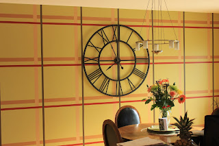
Making plaid is right up my alley. I even have a plaid dining room wall.

This room is on the east side of the house, and in the morning light, this green seemed a little loud when I first painted it, though it doesn't look as green in this picture as in real life. I was concerned that my husband would hate it because it was too bright, so I decided to tone it down by throwing in the rest of our colors to break it up a bit. It really did make a huge difference, and I was surprised at how 3 dimensional it looks because the colors don't blend like a true plaid. People are always surprised to find out it's painted on. I'm happy to say, after 7 years, I'm not the least bit tired of it and am not planning to change it anytime soon. It still makes me happy every time I walk in the door.

Thanks for stopping by,
T

Supplies
PTI: stampers select white and true black cardstock, background basics: super stripes, diamond impression plate, wonderful words die, white button
SU: basic black, pool party and daffodil delight inks, just believe
Martha Stewart: butterfly
other: black Sharpie, white embroidery floss, yellow Copics, corner rounder, painter's tape

Wall: 5 shades of paint, 3 rolls of painter's tape, laser level, 3 evenings, and some patience!

Wednesday, 1 May 2013

Fusion #4


A quick card and a quick post for the Fusion challenge this week. I love this DSP, which I used yesterday for my niece's birthday card, and could see it working with Jackie's sketch, so I pulled it out again. 'Tis the season to stock up on mothers' day cards. It didn't really turn out the way I pictured it in my head on a white card base. It was really bland and unfinished looking, but changing the card base to yellow and giving it some texture adds something to it.

Here's a look at the theory behind the Fusion challenge, and the sketch I used as my starting point:

Thanks for stopping by,
T

Supplies
SU: barely banana and tempting turquoise cs, pawsitively prints dsp, word window punch, swiss dots embossing folder, beautiful wings embosslit, teeny tiny wishes, tempting turquoise ink
other: corner rounder, green baker's twine, PTI white button